
Everything began in far 1810. The year in which the company was founded should be framed. Not in many companies the control stands firmly in the founder family’s hands. The ability to innovate is at the roots of a success which searches strength and a distinctive point in its stability. Now this historic brand, owned by ‘Oleificio Zucchi’, updates. It is not enough to just have good content, and therefore quality and variety of products, besides a competitive business structure. Image, too, has its own importance. To cast one’s mind into the future means updating the appearance presented on the outside, in order to adapt it to evolving times, but also to characterize one’s identity, making it different and more peculiar in comparison with other ones. From a distance, the new appearance of ‘Zucchi’ olive oils may just seem superficial, but it is actually substantial, even bold.
This happens starting from the labels, in pastel shades, which refer to an unusual profile and now characterize the whole range of olive oils. Everything is enhanced, even such products as marc oil, or olive oil itself. This project is realized without neglecting, of course, the extra virgin olive oil in all its forms, from 100% Italian oil to the one, always of Italian origin, but coming from organic farming, up to extra virgin oils which come from the Countries of the European Union.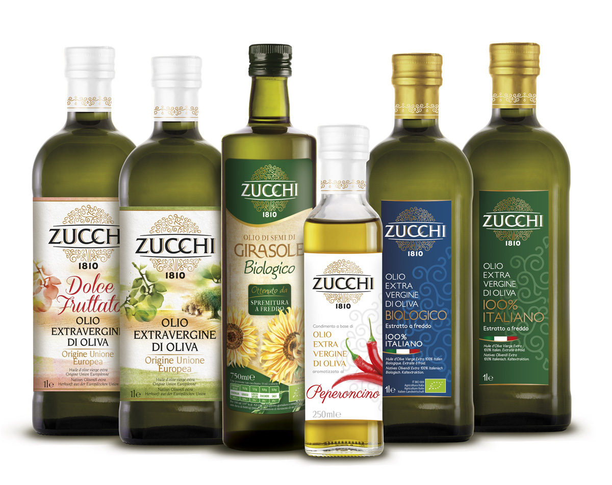
The harmonious blends of oils
The real innovation - that maybe not everyone can immediately notice, if the complexity of olive oils is not known - is the ‘Dolce Fruttato’ extra virgin olive oil, which is not a mere play upon words, but it has an important meaning, which removes all doubts about the real perception of the oil’s quality. Many people believe that sweet oil is a lower quality one, because it is associated with oil obtained from ripe olives, whose life is shorter because they are less rich in antioxidants. This is not true. The perception of ‘sweet’ is not in contrast to the fruity perception of the extra virgin oil. An expert combination of different oils produced by the many olive groves allows satisfying both consumer’s taste preferences (who prefers a sweet oil, neither bitter nor spicy), and at the same time guaranteeing the quality, that means more or less marked olfactory and taste sensory notes, bitter and spicy.
In this case, by tasting the ‘Dolce Fruttato’ by Zucchi, the consumer feels both sensation of sweetness, and bitter and spicy taste, or, in more precise terms, at first glance this oil is sweet, harmonious and round, but then slowly and gradually opens, expressing more pronounced fruity notes, also giving rise to bitter and spicy perceptions, always well balanced and proportioned. Here lies the ability to think to an oil which meets the criteria of quality without neglecting consumer’s preferences as for taste. This is not easy, and therefore here lie the Italian professional competence and ability to achieve harmonious blends of oils. Blends are the equivalent of wine cuvees. Therefore, no ‘random’ oils are bottled, indistinctly taken by tanks, but a sensory analysis is carried out, distinguishing the characteristics of the different oils to combine, just as it happens with wines. Therefore, a customized sensory profile is studied. The ‘Dolce Fruttato’ is born from this process.
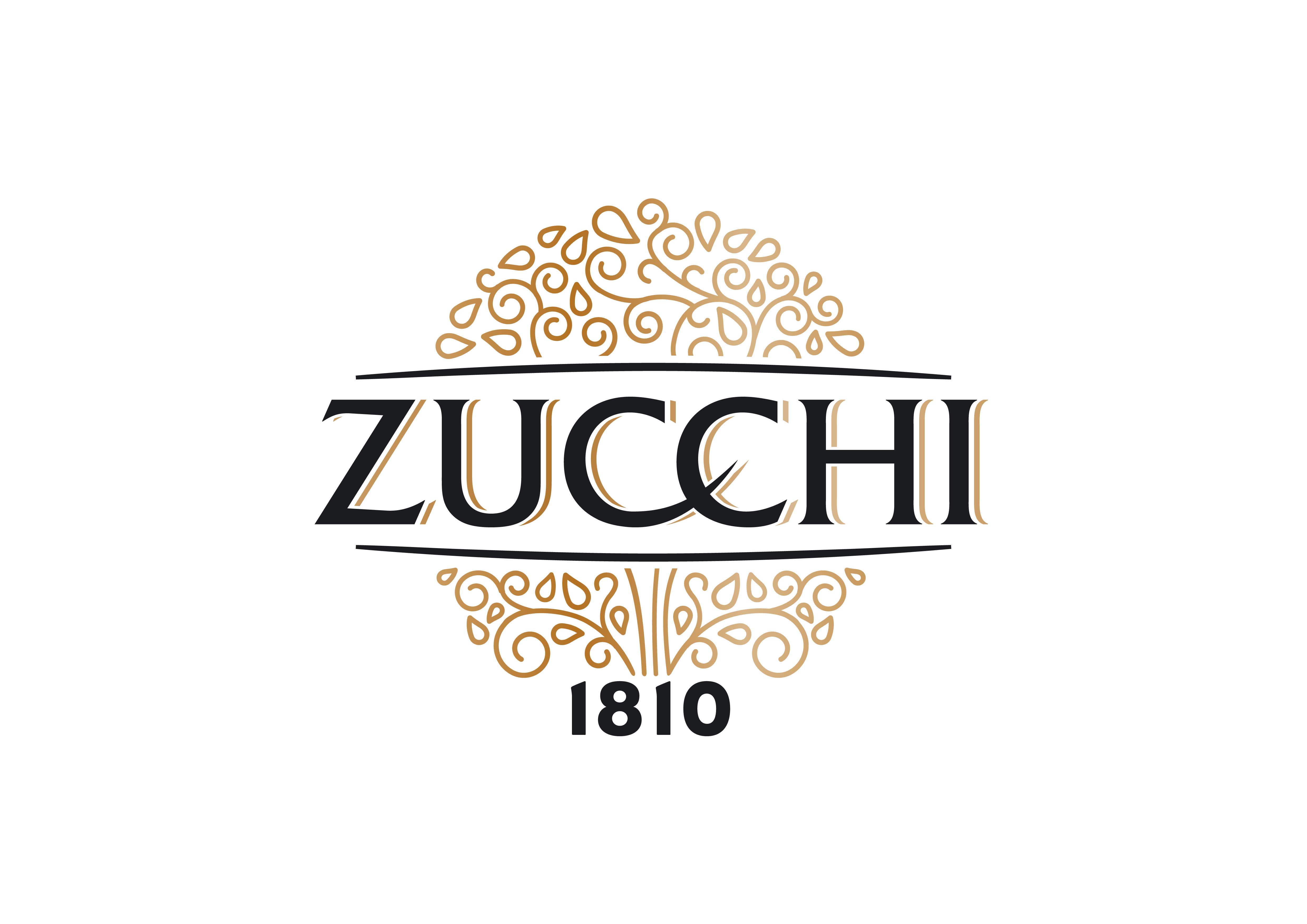 To address consumers all over the world, who are different as for food habits and cultural knowledge of oil. At heart of the new ‘Zucchi’ logo, where ideally lie its roots, the year of foundation of the company places itself, so that it indicates Zucchi family’s century-old tradition and his know-how. At the centre of the new logo, the family name stands out: the two ‘C’ are harmoniously intertwined, for witnessing family ties. The simple, clear lettering, embellished with a golden typing, is highlighted by two thin horizontal lines, above and below it. The decorative element, in its stylized form which in some places evokes oil droplets, symbolizes the tree of life, tradition, and rooting in the earth, with its aromas and flavours. The development of the packaging has been carried out starting from the new positioning of the brand and the ‘scent of olive’ concept. Therefore, graphics translated the concept of scent, which by its nature is so elusive and undefined as a memory, dream, or sensation, in a picture which took shape in the watercolour outline.